Birmingham digital agency Opace discuss responsive web design
June 12, 2015 (PRLEAP.COM) Business News
Search results that favour mobile-friendly websitesJune 12, 2015 - On 21st April 2015 Google released the mobile-friendly algorithm update codenamed "Mobilegeddon", meaning that mobile rankings would differ for mobile-friendly sites.
"With so many people using their smartphones and tablets to browse the web there is a greater need for businesses to make their websites compatible with these devices" says David Bryan, Managing Director of Birmingham based digital agency Opace. David continues, "Google is a big fan of responsive web design in particular, so it wouldn't be surprising if the search algorithm rolls out further algorithm updates to elevate websites which are mobile and tablet friendly."
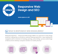
This is explored further on the responsive web design infographic produced by Opace.
The need to invest in responsive web design
One of the ways businesses can ensure their website is compatible with mobiles and tablets, as well as desktops and laptops is by investing in a responsive web design.
Whilst a responsive web design alone is unlikely to give a website a ranking boost (on its own), it is one of three methods the search engine recognises as proper coding of a mobile friendly website and will therefore enable businesses to comply with Google's guidelines and avoid being punished.
Definition of responsive web design
Responsive web design is defined on Wikipedia as 'an approach to web design aimed at crafting sites to provide an optimal viewing experience across a wide range of devices (from desktop computer monitors to mobile phones).' It allows businesses to offer their customers the same great viewing experience whether they are using a device with a 460, 768 or 1920 pixel (or any other size) screen. Unlike mobile and tablet websites, which are built separately to a desktop site, responsive web design only uses one piece of content, one piece of code and most importantly one URL.
Trends in mobile internet usage
With mobile internet usage growing by 67% from August 2013 to August 2014, it only seems sensible that businesses make the effort to provide a website that caters for their mobile audience. New figures show that whilst desktop viewing is declining (dropping from 78.1% to 64.7% users), mobile and tablet viewing is on the rise with growth of 67% and 42% respectively.
In some parts of the world mobile internet usage has even exceeded desktop usage. In India, Nigeria and South Africa a larger percentage of people use their mobile phones to browse the internet than desktop computers and it is believed that this will be the case in the UK, US and other parts of the world over the next couple of years too.
With news that mobile and tablet internet usage is set to takeover desktop internet usage, it is no real surprise that Google is making mobile and tablet compatible designs a key requirement for websites. Whilst you could choose to build a separate mobile or tablet site in order to meet their requirements, the fact that Google has said they consider 'using web design, namely serving the same HTML for all devices using media queries to decide rendering on each device' to be best practice, suggests that responsive web design is the preferred method.
Reasons to invest in a responsive web design
Aside from pleasing Google, there are plenty of other great reasons to invest in a responsive web design including the fact it offers users a better experience, which ultimately leads to improved brand loyalty and higher conversions. Not only that but with a responsive web design, you only need to create content once, which can save you a considerable amount of time and money.
Using a responsive web design will essentially future-proof your business website. Even as new devices emerge, the coding structure of a responsive web design will mean that it is already compliant and able to offer users the same great browsing experience.
Benefits of responsive web design
Responsive web designs also have significant SEO benefits the same of which cannot be said for creating separate mobile and tablet-friendly websites. When asked about responsive web design, Google's Matt Cutts said "There are fewer SEO drawbacks when using responsive design versus a lightweight mobile version of the website" and stated that by using responsive web design techniques to build your website, there's no need to worry about split PageRank or duplicate content issues that could potentially harm your website's search rankings.
Deliver what visitors and Google want
The fact Google prefers responsive web design is a reason in itself to invest in one for your business website, especially if it could help you to avoid being penalised in the future.
Those that cannot keep up with the changes in the industry and fail to provide websites that are configured for tablet and mobile usage could see a drop in their rankings, a loss of customers and a drop in sales especially if Google does decide to change its search algorithm.
If you want to keep on Google's good side (and your customers' too) the best solution is to build a responsive web design for your website and that is something the web design and SEO experts at Opace can help you with.
Find out more information about Opace's web design and SEO services at www.opace.co.uk.
Contact information:
Telephone: 0845 017 7661
Email: info@opace.co.uk
Address: Opace Ltd,
Longbridge Technology Park,
Birmingham,
West Midlands,
B31 2TS
Image credits: Alvaro Rubioc and Aurimas Adomavicius


